Home
Limit orders usability
Bitpanda
2024

Bitpanda
Limit orders discoverability: the right friction
Limit orders are a very important feature for people that are transitioning from novice to advanced traders, and at the time, one of the most requested improvements to Bitpanda. When the feature released users struggled to access it because while the feature was well thought through, the MVP had not addresses the entry points to it well.
When the limit orders feature was released, the design assumed that the user’s thinking would be "I want to buy BTC when it hits 10.000 EUR"


On the first interaction, the user would see the tooltip pointing to the entry point that allowed them to change the order type sheet.
However, there were some “desire path problems”.

Through the app there were several points that were supposed to be populated with open limit orders. However, they had an empty state that allowed to create a limit order. Once the user created a limit order, the elements would be populated, so the button to create a new order disappeared.
This meant that users wouldn’t learn the “proper” way of creating an order and did not find the pill to change the order type.

The preferred entry point was the empty limit order list in the asset detail page

Once the section was populated, the entry point was no longer there!

The path that most users chose, entering from the empty limit order widget in the details screen
My role
I joined the trading team when the feature was released and the numbers resulted to be disappointing. The designer of the feature had transitioned to another project so I was chosen to help in a focused and tactical manner.
This is one of the most important and busy teams in Bitpanda, so I only had two weeks to research and suggest improvements, meaning that time was short and balancing effort and impact was crucial.
Test 1 - Finding out where we are
With two weeks to design and deploy ideas due to incoming high priority projects, the first thing I suggested when I landed in the team was to find out where we stood. My suggestion was to make a battery of user tests with 15 users to measure the usability of what we had in the app.
The data showed that the empty states were working, so I focused on the entry point in the trade flow:
Are the elements in the trade flow UI working as intended?
What are the main usability issues?
How’s our conversion? (not statistically significant, but would give us an idea)
Test structure
The test had two parts
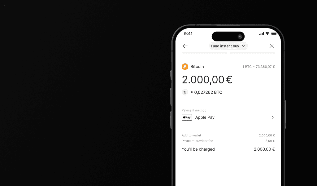
Make a market order - Buy 1.000 EUR of Bitcoin
With all the tooltips and indicators, like a first interaction
Make a limit order - Buy 1.000 EUR of Bitcoin at 50.000 EUR
With all the tooltips and indicators removed

I suggested to structure it like this because most users would encounter all the tooltips and indicators the first time they trade, which in most cases (+95%) is a market order. This means that they will pay no attention to anything unrelated to that type of order. Are the elements in the trade flow UI working as intended?
Results
The results were the following:
Only 2 users managed to make a limit order out of 15
Users do not pay attention to tooltips if irrelevant to the flow
The pill in the header was not intuitive nor discoverable
I needed this concrete information to have a baseline for the future testing of possible solutions, this way we had a replicable user test and we had the current UI’s performance as a baseline for comparison.
"Without a baseline, you cannot measure impact, and without impact, you cannot measure improvement"
Derek Lomas, my MSc thesis supervisor
Test 2 - Testing solutions
Because the lack of time, the PM and I prioritised testing simpler to implement solutions, so I presented an alternative use of the sheet and the tooltip combination. What if we changed the order and we showed the sheet first and then show the tooltip?
This…

Or this?

I suggested to make a test to compare how this performed. The test would be identical to the previous one, only changing the order of the sheet and the tooltip.
I had 1h30 to pick their brains, so we structured the sessions as follows:
Results
12 users managed to make a limit order out of 15, from 13% to 80% change.
Making the conscious decision helped the users learn the pattern
Adding that bit of friction allowed to create a better user experience
Other ideas that were put to test
Showing the order type sheet every time
It performed perfectly in our third user test (100%)
But, too much friction when 90%+ of trades are market orders
Changing Bitpanda’s “trade sheet” to include limit orders
This entry point is used by less than 20% of users
Creating an alternative
The feature just launched, so we could not make significant changes to the UI

Final changes
The final changes were:
Re-designing the “filled states” back into entry points, using what we knew that users were using from the data
Changing the order of the sheet and the tooltip, what I suggested in the first user test
Changing the titles into more user centric copy, this was presented by the content team and seemed an easy win and more user centric
The preferred entry point was the empty limit order list in the asset detail page
Once the section was populated, the entry point was no longer there!
Outcomes
We managed to test, design and build the changes in less than two weeks. These are the outcomes from those changes:
From the first two months that the feature was live to the third and fourth months, the trade volumes went up 180% for buying and and more than 200% for selling
Limit orders went from representing less than 1% of the total trade volume to almost 5%
Limit orders achieved the one year of generated fees with limit orders goal in less than three months
Limit order users log in around 40% more times per month and trade more frequently
My main learning point here was that there is a correct amount of friction that you can add to a flow. Especially in an environment where users may be ignorant and need more guidance, friction in a flow is something to be leveraged.